Sorry. We did not find anything.

  • DESIGN & INNOVATION

    Unveiling the New Super Great: A Redesign Story

    日本語

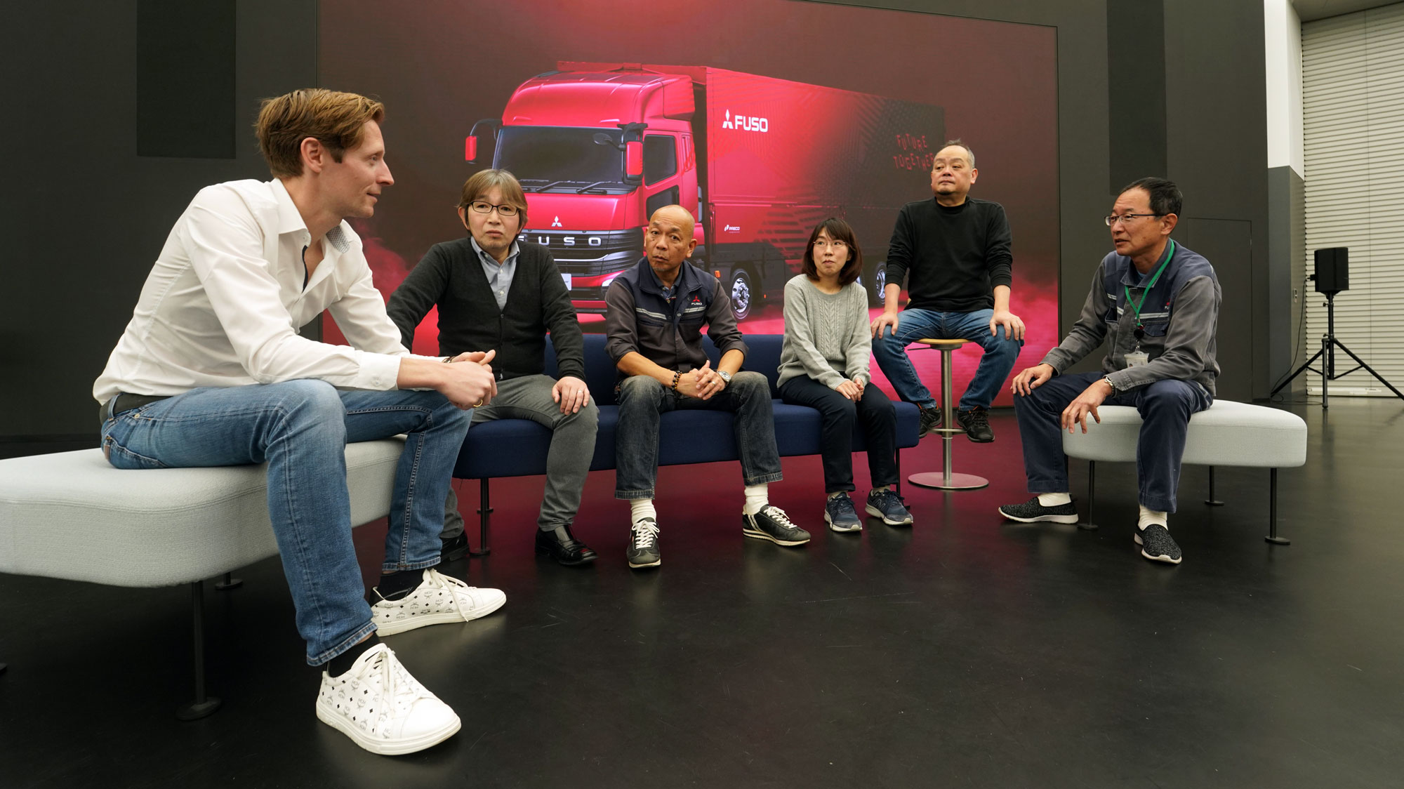
The design team provides exclusive insights into the development of FUSO's new Super Great.

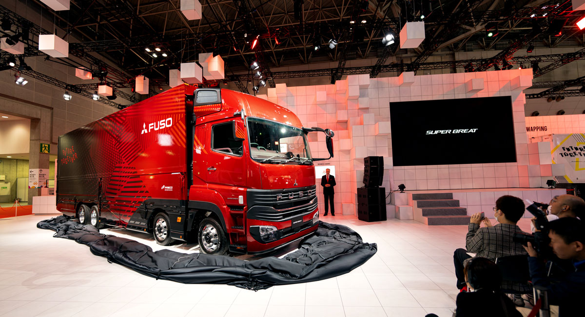
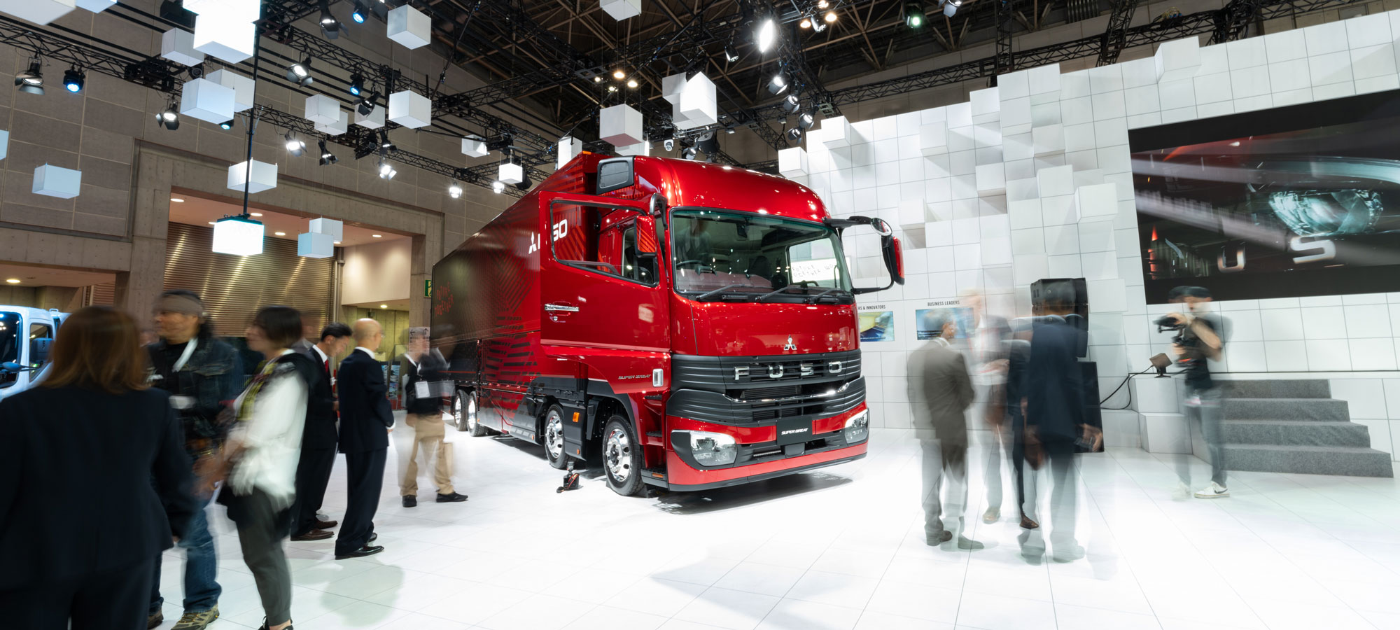
When the black veil surrounding FUSO’s new Super Great fell to the floor at the 2023 Japan Mobility Show (JMS) revealing an astonishing red heavy-duty truck, FUSO’s design team was hoping to make an immediate impression. 

“I rather prefer a ‘Wow, that is different’ than ‘Oh, another one,’” said Benjamin Nawka the Head of Design for Mitsubishi Fuso

The public unveiling of the new Super Great represented the final stage of a challenging process, which resulted from an intricate confluence of safety, functionality, and aesthetics. 

But what goes into a redesign, and what happens during the decision-making process? Here’s a sneak peek of how FUSO design team redesigned the new Super Great. 

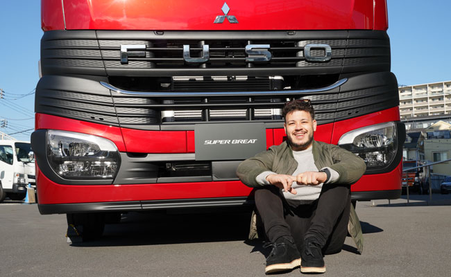
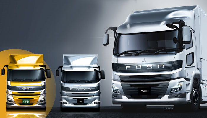
FIRST IMPRESSION  The new model that stood in front of the crowd at JMS was imposing and elegant. The super high roof cabin lent it a leaner, taller appearance, and the remade grill and logo placement gave the face of the vehicle a markedly different look than not only its predecessor, but also competitors.  

However, a closer look confirms it is indeed a family member of FUSO’s lineup. 

The last major redesign of the Super Great took place in 2017, and the latest version focuses on improved economy, safety, and comfort. That started with an upgraded cab design and a discernible separation from the previous model’s face. 

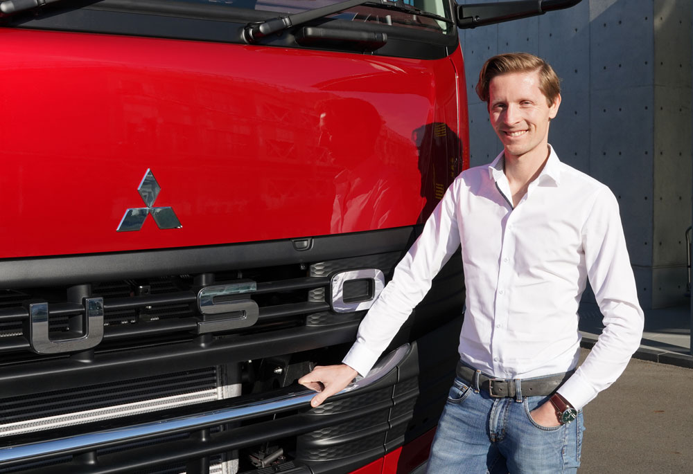
SEEING EYE TO EYE  One of the most visually striking departures of the redesign is the grill, which is an evolution of the black belt motif ingrained into other FUSO products, like the light-duty Canter truck or heavy-duty Aero Queen coach bus. 

While the black belt is integrated into the new Super Great, it’s much wider and rests higher and more prominently on the vehicle. The iconic three-diamond emblem also rests saliently above the belt on full display. 

The team felt the new position and size perfectly balanced the proportion of the cabin for a less aggressive attitude, which achieved a sophisticated and powerful yet approachable design. 

DESIGN MEETS FUNCTION  But what you may not know is that the black belt serves a specific aerodynamic function. The corners and aero lines support a better airflow that no other comparable vehicle has. 


“We want to push the boundaries and question what we know and continuously improve our products, brand and designs.”

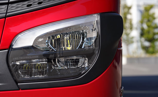
Furthermore, the redesigned grill’s use of resin and more environmentally friendly surface treatments help reduce CO₂ generation in the manufacturing process. The updated model also features a new LED headlight configuration, integrating both the fog and signal lamps into a consolidated area, which also contributes to overall aerodynamic improvements.

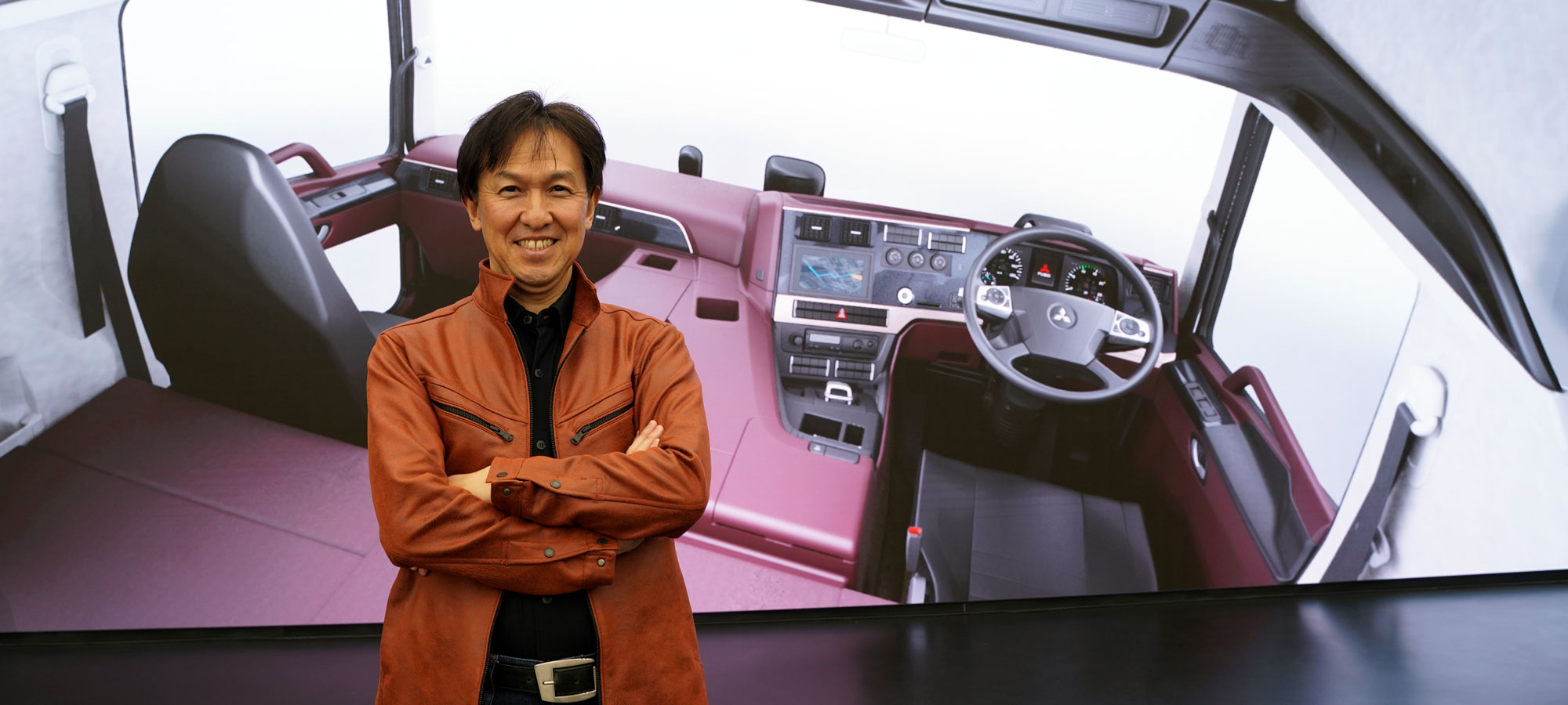
DRIVER’S PERSPECTIVE  When a driver first enters the vehicle, they will be struck by the warm, red color of the cockpit. But as they begin to drive, they will notice the detailed improvements that increase the ease of usability.

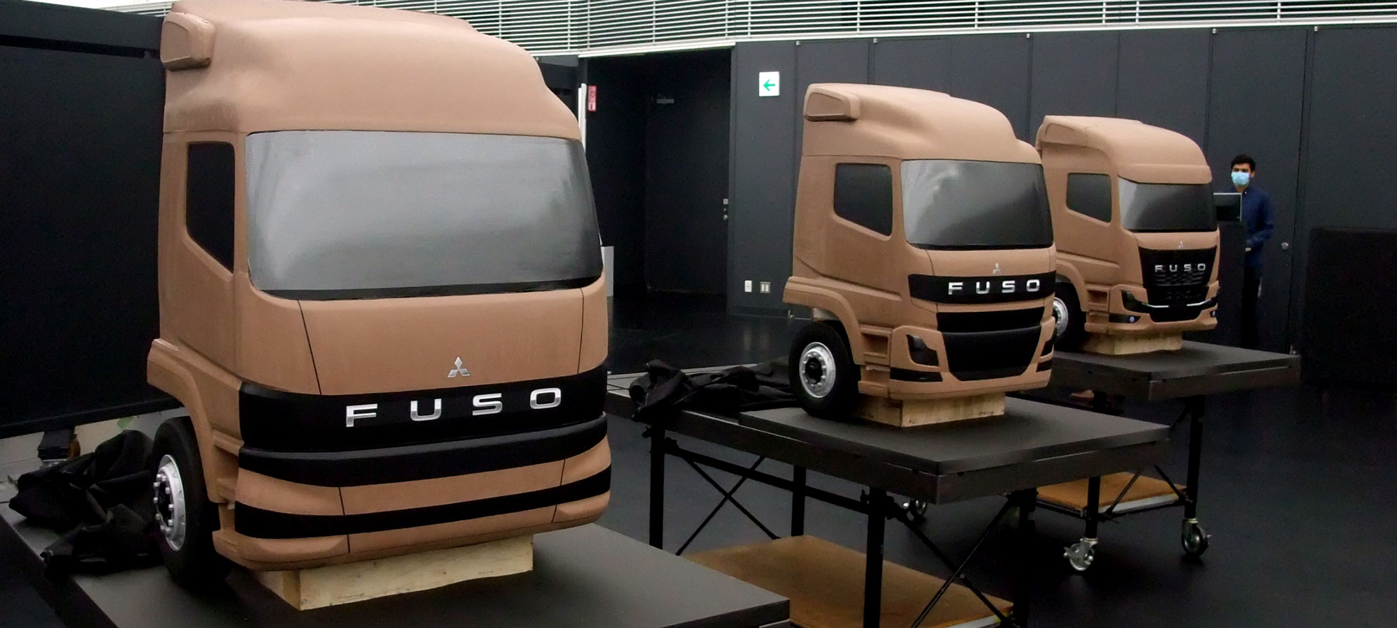
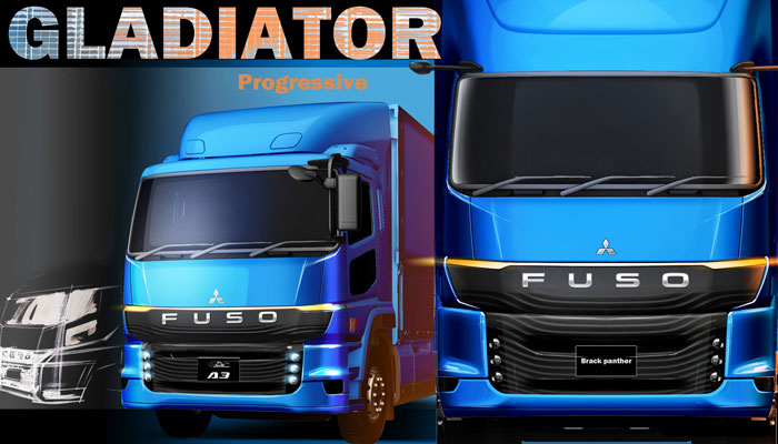
A DIFFERENT APPROACH TO DESIGN Beyond more immediate visuals, FUSO’s design team starts the process by prioritizing the customer experience and utilizing new techniques and tools, including virtual reality.

The electronic parking brake, for instance, has a beautiful appearance, and the seat enhancements optimize the overall comfort for improved ergonomics.  

But perhaps the high roof design is one of the most dramatic differences that provides the driver with a more comfortable space and more storage capacity in overhead compartments. Ambient lighting also spreads soft light toward the ceiling, where being in the cockpit feels more a modern airliner than a truck. 

The team harnessed user feedback to form clear expectations that they then translated into the design using the latest technology. The aim was to develop a product that not only looked better, but also improved usability, quality, and reliability. 

THE DESIGN PROCESS  Designing a commercial vehicle is one of the most challenging fields in mobility design. A great appearance helps the brand shine, but designers cannot compromise on functionality.  

“The main concept was to develop a new design that references the past but has a strong future attitude at the same time,” Satoshi Tsuchide of FUSO’s design team.

In the past, the Super Greats were more horizontally oriented – a great match for the signature blackbelt design adorning recent FUSO vehicles. However, aerodynamics are a priority. This combined with the reference to heritage with a future attitude made the new Super Great MY24 face not mainstream by design, hence the updated black belt motif.   

FUNCTIONALITY FIRST  Any design elements that compromise the functionality are not considered. In the end, the vehicle is a tool that is used daily for hours on end. Any mistake that is felt or seen will be experienced again and again. But rather than looking at this as an obstacle, it influences the design.

One example is the thoughtfully integrated side sensors, which complement the dynamic appearance together with the LED head lamps. 

THE NEW SUPER GREAT AND BEYOND  The ultimate goal is for the new Super Great to bring joy and satisfaction for the end users as well as making them proud of what they do in the safest possible way. 

“We want to push the boundaries and question what we know and continuously improve our products, brand and designs,” said Nawka. 

For detailed information on the new Super Great, please visit our product page.